Mobile-first indexing has completely reshaped how search engines rank websites. Today, over 70% of all search traffic comes from mobile devices. That means your website’s mobile experience now plays the biggest role in how well it performs on Google.
In the past, Google used desktop versions of websites for ranking. But with mobile-first indexing, it now prioritizes how your site looks and functions on smartphones. If your site loads slowly or displays poorly on smaller screens, your ranking can drop — even if your desktop site is perfect.
This shift makes a strong mobile SEO strategy essential for every business. A mobile-friendly design improves user experience, reduces bounce rates, and increases conversions. Responsive layouts, fast page speed, and easy navigation are now core SEO factors.
At WorkSEO, we help brands adapt to this mobile-first world. Our SEO experts focus on building fast, user-friendly websites that perform seamlessly on all devices. Because when your mobile experience works — your rankings, traffic, and sales grow too.
In short, mobile optimization is no longer optional. It’s the foundation of modern SEO success.
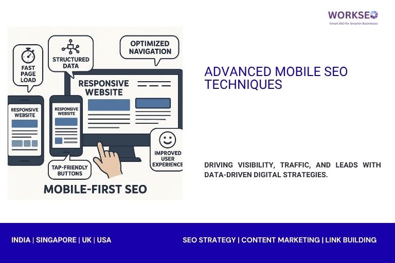
What Is Mobile SEO and Why It Matters
Mobile SEO means optimizing your website so it performs well on smartphones and tablets. It ensures your pages load quickly, display correctly, and provide a smooth user experience on smaller screens.
Google now uses mobile-first indexing, which means it ranks mobile-friendly websites before desktop-only versions. In simple terms, if your site doesn’t work well on mobile, it won’t rank well — no matter how strong your content is.
A good mobile SEO strategy focuses on three key factors:
User Experience (UX): Visitors should easily find what they need without zooming or scrolling endlessly. Clear layouts, readable fonts, and simple navigation are essential.
Loading Speed: Mobile users expect pages to load in under three seconds. A slow site pushes people away and signals Google that your site isn’t user-friendly.
User Intent: People on mobile often search with quick intent — such as finding a store nearby or comparing prices. Optimizing for local SEO and intent-based keywords helps capture this audience.
At WorkSEO, we help businesses fine-tune their websites for mobile success. From improving load times to enhancing mobile layouts, we make sure your site meets Google’s latest standards.
In today’s mobile-first world, your website must deliver a fast, simple, and engaging experience — or risk losing visibility and customers.
Advanced Mobile SEO Techniques That Work in 2025
1. Mobile-First Indexing Optimization
Google’s mobile-first indexing means it now checks the mobile version of your site first. To maintain strong rankings, your mobile and desktop versions must be consistent in structure, content, and technical details.
Start by ensuring both versions have the same site structure. All pages, menus, and internal links should appear on mobile just as they do on desktop. Missing links or hidden pages can confuse search engines and reduce visibility.
Next, make sure your meta tags match across devices. Titles, meta descriptions, and structured data should remain identical. Even small differences can affect how Google understands and ranks your content.
Your content must also stay the same. Some websites cut text or images to fit smaller screens, but this can harm SEO. Instead, use responsive design that adjusts layouts without removing important elements.
Here’s a quick checklist to follow:
Keep identical headings, keywords, and schema markup on all devices.
Use responsive design instead of separate mobile URLs.
Test your pages using Google’s Mobile-Friendly Test tool.
Monitor crawl errors and fix missing resources like images or scripts.
At WorkSEO, we help brands align their websites with Google’s mobile-first standards. Our experts ensure your site structure, meta data, and content remain consistent — giving you stronger rankings and a better user experience across every device
2. Improve Mobile Page Speed
Mobile users expect fast, smooth, and responsive websites. Even a few seconds of delay can lead to higher bounce rates and lower rankings. That’s why improving mobile page speed is one of the most important parts of mobile SEO.
Google measures page performance using Core Web Vitals, which focus on three key factors:
Largest Contentful Paint (LCP): How quickly the main content loads.
First Input Delay (FID): How fast the site reacts to user actions.
Cumulative Layout Shift (CLS): How stable the layout stays while loading.
A good score on all three metrics improves user experience and helps your pages rank higher.
To check your performance, use free tools like PageSpeed Insights and Lighthouse. These tools show detailed reports on what’s slowing your site down — from large images and unused scripts to poor server response times.
Here are a few simple ways to boost speed:
Compress and resize images before uploading.
Enable browser caching and use a content delivery network (CDN).
Minify CSS, HTML, and JavaScript files.
Choose a reliable web hosting provider with fast response times.
At WorkSEO, we specialize in optimizing websites for speed and performance. Our team fine-tunes your pages to meet Core Web Vitals benchmarks, ensuring your site loads quickly, ranks better, and keeps visitors engaged — no matter what device they use.
3. Use Responsive Design, Not Separate URLs
Responsive design is the best approach for mobile SEO because it allows one website to adjust automatically to any screen size — whether it’s a smartphone, tablet, or desktop. Instead of creating separate mobile URLs like “m.example.com,” responsive design uses flexible layouts and media queries to display content correctly across all devices.
This method offers several SEO advantages. First, it keeps all your content under one URL, making it easier for Google to crawl, index, and rank your pages. When you use separate URLs, search engines must process duplicate content and redirects, which can hurt performance.
Second, responsive websites create a smoother user experience. Visitors stay longer when your pages look clean and load properly, no matter the screen size. This reduces bounce rates and signals to Google that your site is user-friendly.
Here’s why responsive design works better:
It maintains consistent content across all devices.
It simplifies technical SEO by avoiding duplicate versions.
It helps you keep link equity and authority in one place.
It adapts automatically to new devices and screen sizes.
At WorkSEO, we design and optimize responsive websites that meet Google’s mobile-first standards. Our goal is to ensure your site looks great, loads fast, and performs perfectly on every device — boosting both user satisfaction and search visibility.
4. Optimize for Voice Search
Voice search is changing how people find information online, especially on mobile devices. With tools like Google Assistant and Siri, more users are speaking their searches instead of typing them. This shift means your website needs to adapt to how people naturally talk.
Unlike traditional searches, voice queries are longer and more conversational. For example, someone might type “best gold chain design,” but say “What are the best gold chain designs for men in 2025?” Optimizing for these long-tail keywords helps your content match real user intent.
Here’s how to prepare your site for voice search:
Focus on natural, question-based phrases.
Use structured data (schema) to help Google understand your content.
Write short, clear answers to common questions.
Optimize your Google Business Profile for local voice searches.
Speed also matters — most voice searches happen on mobile devices, so pages must load quickly. A fast, mobile-friendly site improves both visibility and user satisfaction.
At WorkSEO, we help brands optimize content for voice search by targeting conversational keywords and improving mobile experience. Our strategies ensure your website stays visible in this growing trend — helping you capture more organic traffic from voice-enabled devices.
Voice search isn’t the future — it’s already here. By adapting your SEO strategy today, you can stay ahead of the competition and connect better with your audience.
5. Implement Lazy Loading for Media
Lazy loading is a smart technique that helps your website load faster without sacrificing content or SEO. It works by loading images and videos only when users scroll to them, instead of all at once when the page opens.
This approach greatly improves user experience (UX) on mobile devices. Visitors can start viewing content right away, even before all images or videos fully load. It also reduces data usage, which is important for users on slower mobile networks.
From an SEO perspective, lazy loading doesn’t hurt your site’s crawlability — as long as it’s implemented correctly. Google’s bots can now index lazy-loaded images and videos if they are properly coded with native HTML attributes or modern JavaScript frameworks.
Here’s why lazy loading benefits your site:
Faster initial load time improves Core Web Vitals scores.
Lower bounce rates from smoother browsing experiences.
Better performance for image-heavy pages and product listings.
Efficient use of server resources and mobile bandwidth.
To make it work effectively, always ensure that:
Key visuals above the fold load immediately.
Lazy loading uses native attributes (
loading="lazy") where possible.All media URLs remain accessible for Google’s crawlers.
At WorkSEO, we help optimize websites with advanced speed techniques like lazy loading. Our experts make sure your media loads smartly — enhancing UX, saving bandwidth, and keeping your SEO performance strong across every device.
6. Structured Data for Mobile SERPs
Structured data, or schema markup, helps search engines understand your website’s content more clearly. When used correctly, it can turn your standard search result into an engaging mobile-rich snippet — with ratings, images, FAQs, or product details that attract more clicks.
For mobile users, rich results make a huge difference. They allow searchers to see key information instantly without opening the page. This improves both visibility and click-through rate (CTR), which are vital for SEO success.
You can use schema markup for:
Products: Show price, availability, and ratings.
FAQs: Display quick answers directly in search results.
Articles and Blogs: Highlight headlines, authors, and publication dates.
Local Businesses: Share contact info, address, and opening hours.
To implement schema, use Google’s Structured Data Markup Helper or add JSON-LD code to your site’s HTML. Once added, test your markup using Rich Results Test or Search Console to ensure everything works correctly.
Structured data also supports voice search and AI-powered assistants, making your site more discoverable on mobile devices.
At WorkSEO, we integrate schema markup into your SEO strategy to help your site stand out in mobile search results. With rich, accurate data, your brand can attract more clicks, deliver a better mobile experience, and gain a competitive edge in Google’s mobile-first world.
7. Mobile-Friendly Navigation & UX
A great mobile experience starts with simple, intuitive navigation. When users visit your site on a smartphone, they should find what they need quickly — without zooming, pinching, or endless scrolling.
Tap targets like buttons, links, and icons should be large enough to click easily with a thumb. Google recommends at least 48×48 pixels of clickable space for smooth navigation. Avoid placing links too close together, as that can frustrate users and lead to accidental taps.
Menus also play a big role in mobile UX. Use collapsible or hamburger menus to save space and keep your layout clean. Include only the most important links in the main menu, and organize other pages under clear categories.
Here are a few tips to improve mobile navigation:
Keep your design minimal and clutter-free.
Make call-to-action (CTA) buttons easy to spot and tap.
Use consistent icons and simple labels for quick recognition.
Test navigation on different screen sizes before going live.
Good UX doesn’t just make visitors happy — it boosts your SEO, too. Google measures engagement signals like time on page and bounce rate when ranking mobile sites.
At WorkSEO, we design mobile-friendly navigation systems that balance usability and SEO performance. Our goal is to help your visitors move through your site effortlessly — improving satisfaction, engagement, and conversions on every device.
8. Use Accelerated Mobile Pages (AMP) Carefully
Accelerated Mobile Pages (AMP) were once a major part of mobile SEO. They were designed to make web pages load almost instantly on smartphones by using a simplified version of HTML. For years, AMP helped publishers and news sites gain better visibility and faster load times in Google’s mobile results.
However, in 2025, AMP is no longer a requirement for ranking well or appearing in Google’s Top Stories. Google now focuses more on Core Web Vitals and overall page experience instead of relying on AMP-specific technology.
That means while AMP still offers benefits — like lightning-fast loading and reduced bounce rates — it’s now optional. You can achieve similar or even better results with a well-optimized, responsive website.
Here’s when AMP can still be useful:
For content-heavy websites like blogs or news portals.
When you want near-instant loading on low-speed networks.
If you’re targeting regions where mobile data is limited.
But for most modern websites, focusing on page speed, responsive design, and structured data provides the same advantages without the restrictions AMP imposes on design and functionality.
At WorkSEO, we guide brands on when AMP makes sense — and when it doesn’t. Our experts help you build fast, mobile-optimized websites that meet Google’s latest standards, with or without AMP. The goal is simple: create a seamless user experience that drives results on every device.
9. Local SEO for Mobile Users
Mobile users often search for businesses nearby, making local SEO essential for attracting customers. Optimizing for local search ensures your business appears when people need products or services in your area.
Start with a Google Business Profile (GBP). Complete your profile with accurate business name, address, phone number, website, and operating hours. Add photos and regular updates to engage users and improve trust.
Mobile users prefer convenience, so include click-to-call buttons on your website. This allows visitors to contact you instantly without searching for your phone number.
Ensure your business shows up on Google Maps. Mobile-friendly maps help users find directions quickly and increase foot traffic to your store. Use consistent NAP (Name, Address, Phone) information across all online directories to boost visibility.
Other tips for mobile local SEO include:
Optimize for location-based keywords like “coffee shop near me.”
Encourage reviews from satisfied customers to improve credibility.
Use structured data for local business to enhance mobile search listings.
At WorkSEO, we specialize in mobile-focused local SEO strategies. We help businesses optimize their Google Business Profile, improve map visibility, and enable click-to-call functionality. This ensures your brand reaches local customers exactly when they need it — driving traffic, leads, and sales from mobile users.
10. Regular Mobile SEO Audits
Regular mobile SEO audits are essential to keep your website performing well on smartphones and tablets. Mobile technology and search engine requirements change often, so periodic checks ensure your site stays optimized and competitive.
Start with Google Search Console. Its mobile usability report highlights issues like small text, clickable elements too close together, or content wider than the screen. Fixing these problems improves both user experience and rankings.
You should also run mobile-friendliness tests using Google’s Mobile-Friendly Test tool. It provides a detailed analysis of how your site performs on various devices and offers actionable suggestions for improvement.
Other key elements to audit regularly include:
Page speed and Core Web Vitals.
Responsive layout and navigation.
Tap targets, buttons, and menu usability.
Structured data and schema markup visibility.
At WorkSEO, we perform thorough mobile SEO audits to identify and fix any issues. Our team ensures your website remains fast, accessible, and easy to use on every device.
Consistent audits not only improve your mobile rankings but also enhance user engagement and conversion rates. In a mobile-first world, staying proactive with regular checks is crucial for long-term SEO success.
Key Mobile SEO Ranking Factors
Mobile SEO rankings depend on several signals that determine how well your site performs on smartphones and tablets. Optimizing for these factors ensures better visibility and higher engagement.
1. Mobile-Friendliness: Google prioritizes sites that display correctly on all screen sizes. Responsive design and easy navigation are crucial.
2. Page Speed: Fast-loading pages improve user experience and Core Web Vitals scores. Slow pages can increase bounce rates and lower rankings.
3. User Experience (UX): Clear layouts, readable fonts, and large tap targets make browsing smooth. Positive UX keeps visitors on your site longer.
4. Content Consistency: Mobile content should match desktop content. Missing text or images can hurt SEO and confuse search engines.
5. Structured Data: Schema markup enhances mobile search results with rich snippets, helping your pages stand out.
6. Local SEO: Optimizing Google Business Profile, maps visibility, and click-to-call features improves mobile searches for local intent.
7. Voice Search Optimization: Using conversational, long-tail keywords aligns with how mobile users speak their queries.
8. Core Web Vitals: Metrics like LCP, FID, and CLS measure page performance and layout stability.
9. Technical SEO: Proper indexing, crawlability, and canonical tags ensure mobile search engines can access your pages efficiently.
At WorkSEO, we focus on all these mobile-specific ranking factors. By optimizing your site for speed, usability, and mobile search behavior, we help you achieve stronger visibility, higher rankings, and better engagement from mobile users.
Common Mobile SEO Mistakes to Avoid
Many websites lose mobile rankings due to simple but critical errors. Avoid these mistakes to maintain strong performance on smartphones and tablets:
Intrusive Popups: Popups that cover content frustrate users and can trigger Google penalties.
Hidden Content: Important text or images hidden on mobile can hurt rankings and user experience.
Slow Page Speed: Large images, unoptimized scripts, or heavy elements increase load time.
Poor Internal Linking: Links that are hard to tap or inaccessible reduce crawlability and UX.
Non-Responsive Design: Sites that don’t adjust to screen sizes create a bad mobile experience.
Tiny Tap Targets: Buttons or links that are too small make navigation difficult.
Ignoring Core Web Vitals: LCP, FID, and CLS issues can lower mobile search rankings.
Duplicate Mobile URLs: Separate mobile pages without proper canonical tags can confuse search engines.
At WorkSEO, we help businesses identify and fix these mobile SEO mistakes. Correcting these issues improves usability, rankings, and overall engagement on mobile devices.
Conclusion
Mobile SEO is no longer optional — it’s essential. Prioritizing user experience alongside technical SEO ensures your website performs well on every device. Fast load times, responsive design, clear navigation, and optimized content all work together to improve rankings, engagement, and conversions.
Integrating UX and SEO creates a seamless experience for mobile users while keeping Google happy. Businesses that focus on mobile-first strategies stay ahead of the competition and capture more traffic from the majority of online searches that happen on smartphones.
Ready to boost your site’s mobile performance? Contact WorkSEO — India’s trusted mobile SEO agency — to create a custom strategy that drives results on every device.
Latest Insights from Our SEO Experts
Stay updated with actionable SEO tips, strategies, and trends from the WorkSEO editorial team—designed to help your business grow organically and rank higher on search engines.
Introduction If you are planning to learn SEO and build a career in digital marketing, you are on the right […]
After completing a BSc degree, many students face one big question: “What should I do next?” Traditional career paths like […]
In today’s digital world, many women are looking for ways to restart their careers, earn from home, and become financially […]